

Components
Last updated: 12 July 2023
Header
Variants
Ken Burns Effect
Typography
From H1 to H6
Cards
Variants
For every occasion
Footer
Variants
Light & dark
Filter
Buttons
Variants
Simple and rounded
Section
Variants
-
Search
Variants
-
Form
Variants
-
Content
Variants
-
Configurator
Variants
-
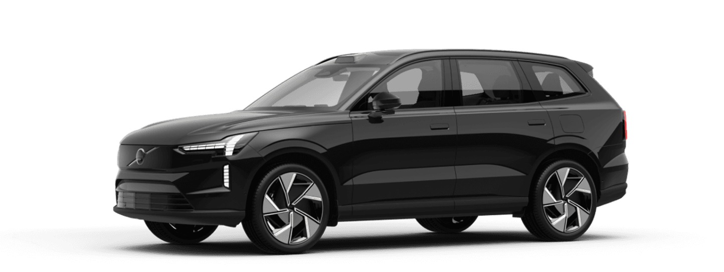
Now that electric driving has taken off, the design system is focused on the electric models to show the latest developments and mutual differences.
Pick what you like, download the Figma file and electrify away. Feedback, shoutouts are welcome at @sandr.
Mobility Service Nederland is the expert in the field of mobility with services in various branches such as electric lease, short lease, financial lease, business lease and replacement transport. The design system for MS is designed to give shape and color to all 7+ websites under 1 corporate flag and appearance.
Horizontal filters
Apply filters horizontally instead of vertically in a column layout. For the desktop and tablet user there is more space for the auto cards. And on mobile it is also impossible to fit vertically and often present via a fold-out or popup screen.
Cards Deluxe
Apply variation to the cards of car in the offer. Show labels (new, discount, promotion) and switch using an image that fills the background. This stimulates the visitor and you don't just show 'sterile' cars.
Configurator with AI
Make your configurator smart, only show the steps that are actually relevant to the car that the user is configuring, so you streamline the flow and only show information that matters.
Avoid the carousel
Carousels are dated, research shows users perceive them as advertisement and skip the part. It has often been used to push and present slides internally from different interests.
Users' eyes respond to movement, but with all the different messages in the carousel, there are too many stimuli and it backfires.
Modal if necessary
Ideal for going into depth and explaining a functionality or term, the Modal (Popup). But showing the configurator (the sales tool of every webshop) in a modal is disastrous for 2 reasons: it is more difficult to register statistics and you give users the idea that they have to leave the modal again. A modal has the effect that you intervene and the flow is being interruppted.
Research findings
Site
Homepage
Content Home
Card
Configurator
Menu
Font Size
Remarks
Mister Green
Hero, CTA, Trustpilot
subnavigation of Tesla, other brands and van, Sections
Picture, Price, Delivery time
Hero with warranty explanation about delivery. E-mail address required for next step. 4 steps. Mobile – Fixed bottom section.
Desktop–Fixed top. 5 entries. Icon propose, icon account, icon menu with drop down for rest navigation. Mobile – Suggest icon, account icon, icon menu with drop down.
Desktop – 28 pixels height. Mobile – 25 pixels height.
No filters
Blankert Shortlease
Filter, Cards
Filter, 3 grid cards
Picture, Price, Make, Model, Type.
Request a quote instead of compiling in full screen modal.
Desktop – Icons menu, search, shopping cart and quote button + phone number, 7 menu items. Mobile – Icons menu + phone, submenu with icon + text People, Electric, Company, Actions.
Desktop – 22 pixels height. Mobile – 22 pixels height.
Athlon
Content, Images, Lists
Hero, Filter, 3 grid
Image, Brand, Model, Price
4 steps. Full-screen configurator. Steps are skipped when you can't choose. Left side vertical steps progress. Subnavigation top with model / type and duration and number of km. Bottom overlay with specifications and assemblies with all prices. Image left and options right side, request left side. Mobile – Model/Type section pinned to bottom with price and option to expand.
Desktop – Reviews, My lease car (dropdown), We are Athlon (dropdown), Language, Search, Icon Menu Mobile – Language, Search, Menu
Desktop – 32 pixels height. Mobile – 25 pixels height.
Cards interrupted with USPs block
Leaseplan
Hero, Carousel, Cards, Lists
Filter, 4-grid cards
Image, Brand, Model, Price
Hero with car in the middle and option for 360 degree view Content on the left, summary on the right Button request car goes directly to lease plan with Paint, upholstery, options, accessories such as harmonica hood. Mobile – After scrolling, a section will appear pinned to the bottom with price and Quote and Request buttons.
Desktop – 6 menu items, Service & Contact, My LeasePlan, Favorites, Language Mobile – Menu icon
Desktop – 24 pixels height. Mobile – 24 pixels height.
ANWB
Hero, 2-columns, Content, CTA
Hero, Filter, 3-grid cards
Image, Sticker, Label, Brand, Type, Model, Price
3 steps. Blocks below each other with options Mobile – Section pinned to the bottom with Total per month and ANWB membership per year and fold-out.
Desktop – Part of ANWB, no specific lease menu Mobile - Icons Login, Search, Menu
Desktop – 24 pixels height. Mobile: 24 pixels height.
DirectLease
2-columns, Cards, Hero
Hero, Filter, 3-grid cards
Picture, Model, Type, Label, 2 columns specs.
Step 1 select execution in table view. Step 2 fold out on the right with summary and content as blocks below each other. Option to leave email address and receive configuration. Option to send existing quote. Mobile – Section pinned to bottom with buttons/icons Price, Contract, Car, Quote.
Desktop – 4 menu items with dropdown. FietsLease, MotorLease + login. Button sales@directlease.nl and button telephone number Mobile – Icons Menu, Search, Login
Desktop – 21 pixels height. Mobile – 21 pixels height.
Alphabet
Hero, Cards
Filter, 4-grid cards
Image, Brand, Model, Labels
On the left content, summary car and options on the right Compose -> contract options -> Your data Horizontal steps navigation Mobile – Section at the bottom with Price and buttons Request quote and Request lease contract.
Desktop – 5 menu items, search, My Alphabet Mobile – Search and Menu
Desktop – 28 pixels height. Mobile – 28 pixels height.